TL;DR
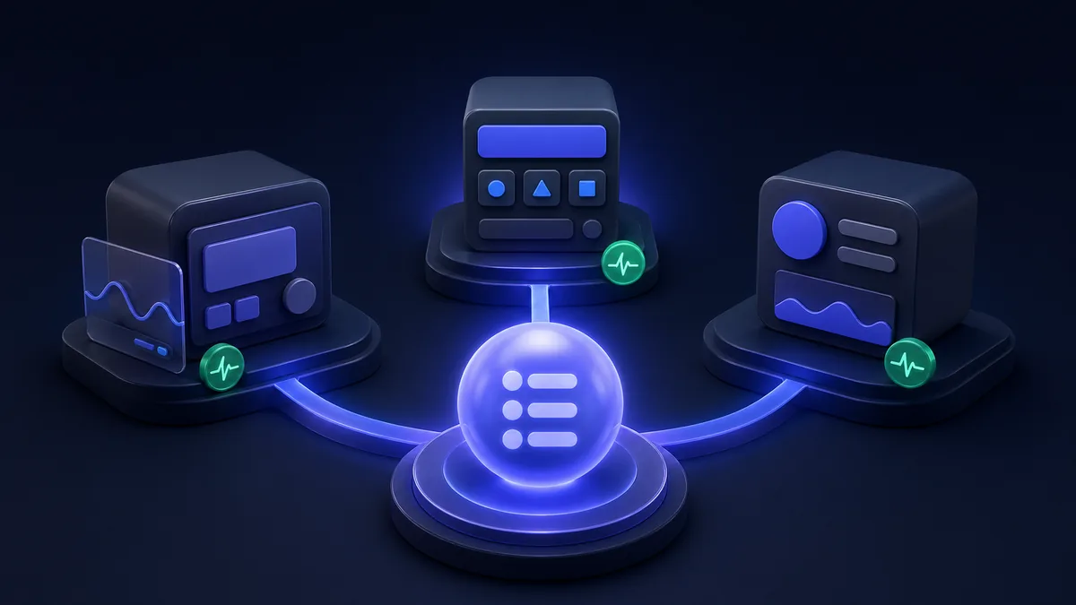
react-bits is the fastest-growing animated React component library in 2026 — #3 in JS Rising Stars 2025 with 26K new GitHub stars. Unlike Aceternity UI (focused on dark, dramatic effects) and Magic UI (polished and opinionated), react-bits prioritizes customizability and developer ergonomics. All three are free and open source, but the right choice depends on whether you need drop-in magic (Magic UI), cinematic drama (Aceternity), or full control over 110+ components (react-bits).
Key Takeaways
- react-bits has 24K+ total GitHub stars and 110+ components covering text, backgrounds, buttons, cards, and loaders — growing weekly
- Aceternity UI (~19K stars) focuses on dramatic 3D/glassmorphism effects with Tailwind + Framer Motion dependencies
- Magic UI (~18K stars) emphasizes polish and ease-of-use with 150+ prebuilt components but less flexibility
- react-bits is framework-agnostic in setup (JS-CSS, JS-Tailwind, TS-CSS, TS-Tailwind) — no forced framework lock-in
- Installation via shadcn CLI —
npx shadcn@latest add "https://reactbits.dev/r/..."makes component adoption frictionless - Key differentiator: react-bits ships accessibility controls (
prefers-reduced-motion) that Aceternity and Magic UI lack by default
Why Animated Component Libraries Matter in 2026
Static UIs feel dated. The bar for visual quality in web apps has risen dramatically as tools like shadcn/ui and Tailwind CSS commoditized clean, functional design. Now developers compete on motion and interaction design — the "wow factor" that makes a landing page or dashboard memorable.
Three libraries dominate this space in 2026: react-bits, Aceternity UI, and Magic UI. Each took a different bet:
- Aceternity: "Give me cinematic effects, dark mode, and dramatic visuals"
- Magic UI: "Give me 150+ polished components that just work"
- react-bits: "Give me control — 110+ components, every variant, full customization"
The fact that react-bits earned 26,200 new GitHub stars in 2025 (#3 across ALL JavaScript projects in Rising Stars) suggests the market is validating the "customization-first" approach.
Feature Comparison
| Metric | react-bits | Aceternity UI | Magic UI |
|---|---|---|---|
| GitHub stars | 24,000+ | ~19,000 | ~18,000 |
| Component count | 110+ | ~50 | 150+ |
| License | MIT | MIT | MIT |
| Dependencies | Minimal (tree-shakeable) | Framer Motion + Tailwind | Framer Motion |
| Setup | shadcn CLI / jsrepo | shadcn CLI | shadcn CLI |
| Tailwind required | Optional | Required | Optional |
| TypeScript | ✅ | ✅ | ✅ |
| Accessibility (reduced motion) | ✅ (planned) | ❌ | ❌ |
| Dark mode | ✅ | ✅ (primary) | ✅ |
| Light mode | ✅ | Limited | ✅ |
| Framework adapters | React (Next.js/Remix planned) | React | React |
| Weekly updates | ✅ | Slower cadence | Monthly |
The Libraries in Depth
react-bits
react-bits (github.com/DavidHDev/react-bits) is built around the idea that every component should be fully customizable — not just styled, but structurally moldable. Its 110+ components span:
Text animations: Split text, typewriter, blur reveal, word scramble, gradient text, scroll-based reveals
Background effects: Aurora, dots, grid, noise, spotlight, gradient mesh
UI components: Magnetic buttons, animated cards, tilting cards, spotlight cards, glass cards
Loading states: Circular spinners, progress bars, skeleton loaders, orbital animations
Installation is intentionally minimal:
# Install a single component via shadcn CLI
npx shadcn@latest add "https://reactbits.dev/r/split-text"

# Or via jsrepo for headless installs
npx jsrepo add github/DavidHDev/react-bits/text-animations/split-text
Components drop into your project as React source files — no package to add, no version to track. You own the code from day one.
Usage example — SplitText component:
import { SplitText } from '@/components/split-text';

export default function Hero() {
  return (
    <SplitText
      text="Build something memorable."
      className="text-5xl font-bold"
      delay={150}
      animationFrom={{ opacity: 0, transform: 'translate3d(0,50px,0)' }}
      animationTo={{ opacity: 1, transform: 'translate3d(0,0,0)' }}
      easing="easeOutCubic"
      threshold={0.2}
    />
  );
}
Every prop is exposed. If you don't like the easing curve or threshold, you change it.
Aceternity UI
Aceternity UI (ui.aceternity.com) made its name with dramatic 3D effects that feel cinematic — beam lines, spotlight follows, floating cards, and aggressive glows. The aesthetic is unmistakably "dark-mode SaaS landing page" and it executes that vision exceptionally well.
Best components: Card hover effect, background beams, tracing beams, spotlight, 3D card, infinite moving cards
Aceternity's key dependency is Framer Motion — every component uses motion.div for smooth GPU-accelerated animations. This is both a strength (buttery smooth) and a constraint (Framer Motion adds ~125KB to your bundle).
Installation:
npx shadcn@latest add "https://ui.aceternity.com/registry/spotlight.json"
Where Aceternity struggles: Light mode. The library was designed for dark interfaces, and adapting components to light backgrounds often requires significant rework. If your app uses light mode, budget extra customization time.
Magic UI
Magic UI (magicui.design) prioritizes breadth and polish. With 150+ components, it has the largest selection of the three. The setup experience is deliberately smooth — install, copy, ship.
Best components: Animated backgrounds (aurora, dots, ripple), text animations (blur in, word pull up), UI widgets (file tree, code comparison, tweet card, globe)
Magic UI leans on Framer Motion heavily and requires it as a peer dependency. The trade-off: a larger bundle baseline but guaranteed animation quality.
Where Magic UI struggles: Deep customization. Components tend to have fewer exposed props compared to react-bits. If you need to change animation curves or timing in subtle ways, you'll be editing the source.
Bundle Size Reality Check
Bundle size matters for Core Web Vitals. Here's the practical picture:
| Library | Framer Motion dep | Per-component overhead | Total budget risk |
|---|---|---|---|
| react-bits | None (tree-shakeable) | ~2–8KB per component | Low |
| Aceternity UI | ~125KB (Framer Motion) | ~5–15KB per component | Medium-High |
| Magic UI | ~125KB (Framer Motion) | ~5–15KB per component | Medium-High |
react-bits' decision to avoid Framer Motion as a mandatory dependency is significant for performance-conscious teams. If you're already using Framer Motion elsewhere in your app, Aceternity and Magic UI add minimal overhead. If you're not, that 125KB Framer Motion dependency is a meaningful addition.
react-bits components use CSS animations and the Web Animations API where possible, with optional Framer Motion for components that genuinely need it.
Accessibility: The Elephant in the Room
All three libraries were originally built with visual impact as the primary goal. None of them shipped with prefers-reduced-motion support out of the box in their early versions.
react-bits is the first to address this directly — it's on their 2025/2026 roadmap as a first-class feature, with built-in support for prefers-reduced-motion media queries planned for all animation components. This matters for WCAG compliance and for users with vestibular disorders for whom excessive motion is genuinely harmful.
The current workaround (for all three libraries) is to wrap animated components in a motion check:
const prefersReducedMotion = window.matchMedia(
  '(prefers-reduced-motion: reduce)'
).matches;

// Conditionally render static vs animated version
When to Choose Each
Choose react-bits if:
- You need maximum customization — exposed animation props, editable source
- You're building light-mode-first or mixed-mode interfaces
- Bundle size is a concern and you're not already using Framer Motion
- You want a growing library with weekly new components
- You need accessibility compliance (when
prefers-reduced-motionlands)
Choose Aceternity UI if:
- You're building a dark-mode SaaS landing page or marketing site
- You want dramatic 3D effects (beam lines, card tilt, spotlight follow)
- You're already using Framer Motion elsewhere
- Visual impact > file size for your use case
Choose Magic UI if:
- You need the largest component selection (150+) to cover every UI scenario
- You prefer "copy and ship" ergonomics over deep customization
- Your brand can adapt to Magic UI's polished but opinionated aesthetic
The Developer Experience Difference
All three use the shadcn CLI copy-to-project model — there's no npm package to version-pin, just source files you own. This makes updates a manual process but eliminates dependency conflicts.
react-bits adds the jsrepo CLI as an alternative:
# Install jsrepo globally
npm install -g jsrepo

# Add a specific component
jsrepo add github/DavidHDev/react-bits/backgrounds/aurora
jsrepo is framework-agnostic and works in non-Next.js setups where shadcn CLI isn't available, giving react-bits broader reach than either Aceternity or Magic UI.
Recommendations
| Use case | Recommended library |
|---|---|
| Dark mode SaaS landing page | Aceternity UI |
| Mixed-mode app with custom branding | react-bits |
| Maximum component variety | Magic UI |
| Performance-critical app | react-bits |
| Quick prototype / showcase | Magic UI or Aceternity |
| WCAG-compliant animations | react-bits (once released) |
For most new React projects in 2026, react-bits is the default recommendation — broad component coverage, minimal bundle overhead, and the most flexible customization model. Aceternity remains unbeatable for dramatic dark-mode landing pages.
Methodology
- Sources: react-bits GitHub (DavidHDev, 24K+ stars), JS Rising Stars 2025 report (risingstars.js.org), Aceternity UI official site, Magic UI official site, reactbits.dev docs
- Date: March 2026
Comparing animation libraries? Also see Best Tailwind v4 component libraries 2026 for Tailwind-native component sets.
For UI component state management: Zustand vs Valtio vs Legend State 2026 — picking the right state layer under your animated components.
More component comparisons on PkgPulse: Aceternity UI vs Magic UI vs shadcn/ui 2026.
All three libraries ship as copy-pasteable source code rather than as runtime npm dependencies — you own the component code directly in your repository, which means no version lock-in and full control over customization without forking.