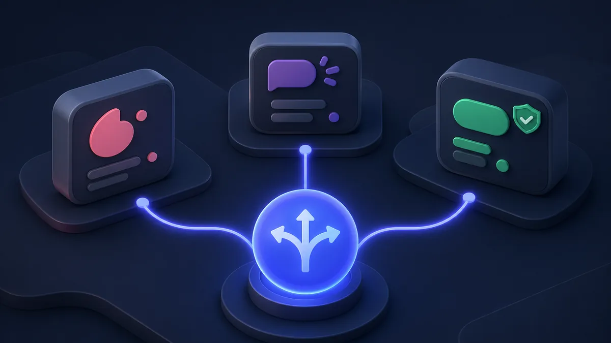
TL;DR
For new projects in 2026: Sonner by Emil Kowalski is the most elegant, accessible, and performant toast library — it's become the community default since shadcn/ui adopted it. react-hot-toast is a solid, minimal choice if you need the smallest bundle with a clean API. react-toastify is the legacy leader — functional but shows its age in the age of Tailwind.
Key Takeaways
- react-toastify: ~4.5M weekly downloads — most installed, legacy-heavy, largest bundle
- react-hot-toast: ~1.2M weekly downloads — minimal API, tiny bundle (4KB), great DX
- Sonner: ~1.8M weekly downloads — shadcn/ui default, stacked toast design, best accessibility
- Sonner has grown ~400% in 12 months — fastest adoption in this category
- All three are functional for most projects; the choice is aesthetics + philosophy
- Sonner wins for new projects: accessible, stacked design, smooth animations
Download Trends
| Package | Weekly Downloads | Bundle Size | Headless? |
|---|---|---|---|
react-toastify | ~4.5M | ~42KB | ❌ |
sonner | ~1.8M | ~11KB | Partial |
react-hot-toast | ~1.2M | ~4KB | ✅ |
Sonner
Sonner by Emil Kowalski (also creator of vaul, cmdk) is now the standard in the Shadcn/ui ecosystem:
// 1. Add Toaster component once (in layout):
import { Toaster } from "sonner"

export default function RootLayout({ children }: { children: React.ReactNode }) {
  return (
    <html>
      <body>
        {children}
        <Toaster richColors />
      </body>
    </html>
  )
}

// 2. Call toast() anywhere:
import { toast } from "sonner"

// Basic toast types:
toast("Event created")
toast.success("Package published successfully!")
toast.error("Failed to connect to npm registry")
toast.warning("Package is 2 years behind on releases")
toast.info("New version available: 4.2.0 → 4.3.0")

// Loading state with promise:
toast.promise(
  publishPackage(packageName),
  {
    loading: "Publishing…",
    success: (data) => `${data.name}@${data.version} published!`,
    error: (err) => `Error: ${err.message}`,
  }
)

// Action button in toast:
toast("New package added", {
  action: {
    label: "View",
    onClick: () => router.push(`/packages/${name}`),
  },
  cancel: {
    label: "Undo",
    onClick: () => removePackage(name),
  },
})
Sonner's stacked design:
Sonner stacks toasts in a collapsed view when multiple are present — only the topmost is fully visible. This prevents toast storms from flooding the UI.
// Customization:
<Toaster
  position="bottom-right"
  richColors          // Colored backgrounds for success/error/warning
  closeButton         // Show × close button
  theme="dark"        // dark | light | system
  duration={4000}     // Auto-dismiss after 4 seconds
  visibleToasts={3}   // Max toasts visible (default 3)
  toastOptions={{
    classNames: {
      toast: "font-sans",
      success: "text-green-600",
      error: "!bg-red-50 !border-red-200",
    },
  }}
/>
Custom Sonner toast:
// Rich custom content:
toast.custom((t) => (
  <div className="flex items-center gap-3 bg-white border rounded-lg shadow p-4">
    <PackageIcon className="text-blue-500 h-5 w-5" />
    <div>
      <p className="font-medium">react-query updated</p>
      <p className="text-sm text-gray-500">5.0.0 → 5.28.0 available</p>
    </div>
    <button onClick={() => toast.dismiss(t)}>×</button>
  </div>
))
react-hot-toast
react-hot-toast prioritizes simplicity and tiny bundle size:
import { Toaster, toast } from "react-hot-toast"

// Setup — minimal:
function App() {
  return (
    <div>
      <Toaster
        position="top-right"
        toastOptions={{
          duration: 4000,
          style: {
            background: "#363636",
            color: "#fff",
          },
          success: { duration: 3000 },
        }}
      />
    </div>
  )
}

// Usage:
toast("Package published!")
toast.success("Deployed to production")
toast.error("Build failed — check logs")
toast.loading("Deploying…")

// Promise toast — auto-transitions loading → success/error:
const deployToast = toast.loading("Starting deployment…")
try {
  const result = await deploy()
  toast.success("Deployed!", { id: deployToast })
} catch (error) {
  toast.error("Deploy failed", { id: deployToast })
}

// Using toast.promise (cleaner):
toast.promise(deploy(), {
  loading: "Deploying…",
  success: "Deployed!",
  error: "Deployment failed",
})
react-hot-toast custom rendering:
// Fully headless — render your own component:
toast.custom((t) => (
  <div
    className={`${t.visible ? "animate-enter" : "animate-leave"} max-w-md w-full bg-white shadow-lg rounded-lg pointer-events-auto flex`}
  >
    <div className="flex-1 w-0 p-4">
      <p>{t.message as string}</p>
    </div>
    <button
      onClick={() => toast.dismiss(t.id)}
      className="p-4 border-l"
    >
      Dismiss
    </button>
  </div>
))
react-hot-toast's custom rendering is the most flexible — the <Toaster> is literally just an anchor point, and you control 100% of the markup.
react-toastify
react-toastify is the legacy leader — it was the default choice for years and is still the most downloaded:
import { ToastContainer, toast } from "react-toastify"
import "react-toastify/dist/ReactToastify.css"  // Must import CSS

function App() {
  return (
    <div>
      {/* Required container */}
      <ToastContainer
        position="top-right"
        autoClose={5000}
        hideProgressBar={false}
        newestOnTop={false}
        closeOnClick
        rtl={false}
        pauseOnFocusLoss
        draggable
        pauseOnHover
        theme="light"
      />
    </div>
  )
}

// Usage:
toast("Default toast")
toast.success("Operation successful!")
toast.error("Something went wrong!")
toast.warn("This may cause issues")
toast.info("Just so you know…")

// With options:
toast.success("Saved!", {
  position: "bottom-left",
  autoClose: 3000,
  hideProgressBar: true,
  closeOnClick: true,
  pauseOnHover: true,
  draggable: true,
})
Why react-toastify's downloads are inflated:
The ~4.5M weekly downloads are largely from existing projects that installed it years ago and haven't migrated. The mandatory CSS import is a pattern from pre-Tailwind times. The progress bar and default styling look dated in modern Tailwind-based UIs.
Feature Comparison
| Feature | Sonner | react-hot-toast | react-toastify |
|---|---|---|---|
| Bundle size | ~11KB | ~4KB | ~42KB |
| CSS import required | ❌ | ❌ | ✅ Required |
| Stacked toast design | ✅ | ❌ Linear | ❌ Linear |
| Promise support | ✅ | ✅ | ✅ |
| Custom components | ✅ | ✅ Headless | ✅ |
| Accessibility (ARIA) | ✅ Excellent | ✅ Good | ✅ Good |
| Position options | ✅ 6 positions | ✅ 6 positions | ✅ 6 positions |
| Drag to dismiss | ❌ | ❌ | ✅ |
| Progress bar | ❌ | ❌ | ✅ |
| RTL support | ✅ | ✅ | ✅ |
| shadcn/ui default | ✅ Yes | ❌ | ❌ |
| TypeScript | ✅ | ✅ | ✅ |
Accessibility Comparison
All three use the ARIA role="status" or role="alert" pattern for screen readers. Sonner's implementation is the most polished:
// Sonner — announces toasts to screen readers properly:
<Toaster
  richColors
  // Sonner uses aria-live regions with appropriate politeness levels:
  // - success/info: aria-live="polite"
  // - error/warning: aria-live="assertive" (immediately interrupts)
/>
react-hot-toast uses a visually hidden <div aria-live="assertive"> for announcements — correct but requires verification for complex custom renders.
Sonner + shadcn/ui Integration
If you're using shadcn/ui, Sonner is included via the CLI:
npx shadcn-ui@latest add sonner
This generates a themed <Toaster> component that respects your design system:
// components/ui/sonner.tsx (auto-generated):
import { Toaster as Sonner } from "sonner"
import { useTheme } from "next-themes"

type ToasterProps = React.ComponentProps<typeof Sonner>

export function Toaster({ ...props }: ToasterProps) {
  const { theme = "system" } = useTheme()

  return (
    <Sonner
      theme={theme as ToasterProps["theme"]}
      className="toaster group"
      toastOptions={{
        classNames: {
          toast: "group toast group-[.toaster]:bg-background group-[.toaster]:text-foreground ...",
          // Inherits your shadcn CSS variables
        },
      }}
      {...props}
    />
  )
}
When to Use Each
Choose Sonner if:
- Starting a new project in 2026
- Using shadcn/ui (it's the default — don't override it)
- You want stacked toasts that don't flood the UI
- Accessibility and modern design aesthetics matter
Choose react-hot-toast if:
- You need the smallest possible bundle (4KB)
- You want fully headless custom renders with no default styling opinions
- Simple promise-to-toast flow is the primary use case
Choose react-toastify if:
- You have an existing react-toastify implementation
- You want the progress bar UX
- You need drag-to-dismiss
Methodology
Download data from npm registry (weekly average, February 2026). Bundle sizes from bundlephobia. Accessibility notes from WCAG audits and library documentation.
Toast Positioning and Z-Index Management in Complex UIs
One operational concern that is rarely covered in library comparisons is how toast notifications interact with the rest of your UI — specifically, modals, drawers, dialogs, and other overlay components. Toasts appear at a fixed position in the viewport (typically bottom-right or top-right) and must have a z-index high enough to appear above other UI layers, including modals.
Sonner handles this well out of the box. Its <Toaster> renders in a <div> with a default z-index high enough to appear above most UI components, and the richColors and theme props ensure consistent appearance regardless of the page's color scheme. When used with Radix UI primitives (which shadcn/ui is built on), Sonner's z-index management is specifically designed to work alongside Radix's portal-based modals without z-index conflicts. The stacked toast design helps here too: when a modal is open and a toast fires, the collapsed stack takes up minimal visual space and does not obscure the modal content.
React-hot-toast gives you more control via its style and className options, but z-index management is your responsibility. This becomes relevant in complex apps with drawer sidebars, full-screen modals, or custom overlay stacks. React-toastify's ToastContainer accepts a style prop and renders into a portal, but its default z-index (9999) can collide with third-party components that also use high z-index values.
For apps with complex overlay hierarchies (common in enterprise dashboards), testing toast rendering while modals are open should be part of the integration test plan for whichever library you choose.
Migrating from react-toastify to Sonner
Teams moving from react-toastify to Sonner will find the migration straightforward but not automatic. The API shapes differ enough that a find-and-replace is insufficient. react-toastify uses toast("message", { type: "success" }) syntax; Sonner uses toast.success("message"). The <ToastContainer> component must be replaced with <Toaster>, and the CSS import (import "react-toastify/dist/ReactToastify.css") must be removed — Sonner ships zero global CSS.
The toast.promise() API exists in both libraries but handles the success case differently. React-toastify's promise toast updates the existing toast in-place; Sonner dismisses the loading toast and fires a new success/error toast with an animation. Both UX patterns are reasonable, but the visual behavior change may require design review. For teams using react-toastify's updateId feature (which updates a specific existing toast), Sonner's toast(message, { id: "custom-id" }) provides equivalent behavior.
If you are migrating a large codebase, creating a thin wrapper function that maps react-toastify's API surface to Sonner is a viable intermediate step: replace the import with a custom notifications module, migrate the underlying library, then gradually adopt Sonner's native API where the wrapper is not expressive enough.
Compare notification library packages on PkgPulse →
When to Use Each
Use Sonner if:
- You are building a new React application and want the most modern, minimal toast component
- You are using shadcn/ui (Sonner is the shadcn/ui default toast)
- You want animated toasts with smooth enter/exit transitions and a stack behavior
- You want server component compatibility in Next.js App Router
Use react-hot-toast if:
- You want a tiny, zero-dependency toast library (~2KB)
- You want first-class support for promise-based toasts (
toast.promise()) - You want customizable toast positions and automatic dark mode support
Use react-toastify if:
- You have an existing project already using react-toastify
- You need the widest feature set: progress bars, icon customization, custom transitions
- You want the most downloads and community support for learning resources
In 2026, Sonner has become the default choice for new React projects, particularly in the shadcn/ui and Next.js ecosystem. react-hot-toast remains excellent for projects that prioritize bundle size. react-toastify's larger API surface is still a valid reason to choose it for applications that need specific customization options the other two don't expose.
A practical accessibility note: all three libraries support aria-live regions for screen reader announcements. Verify that your chosen library announces toasts correctly by testing with a screen reader — dismissal animations in particular can interfere with announcement timing.
Methodology
Download data from npm registry (weekly average, February 2026). Feature comparison based on react-hot-toast v2.x, react-toastify v10.x, and Sonner v1.x. Sonner was created by Emil Kowalski and became the shadcn/ui default toast component in 2023, driving significant adoption growth. react-toastify has the highest download count of the three but Sonner has the highest GitHub star growth rate in the trailing 12 months as of Q1 2026. Bundle sizes: Sonner ~2.5KB, react-hot-toast ~2KB, react-toastify ~9KB (minified and gzipped).
See also: React vs Vue and React vs Svelte, Lucide vs Heroicons vs Phosphor Icons 2026.