MUI has 1.4 million weekly downloads. Mantine has 1.35 million. Six months ago, Mantine was at 900K. That growth rate says something about what developers want from their component libraries in 2026.
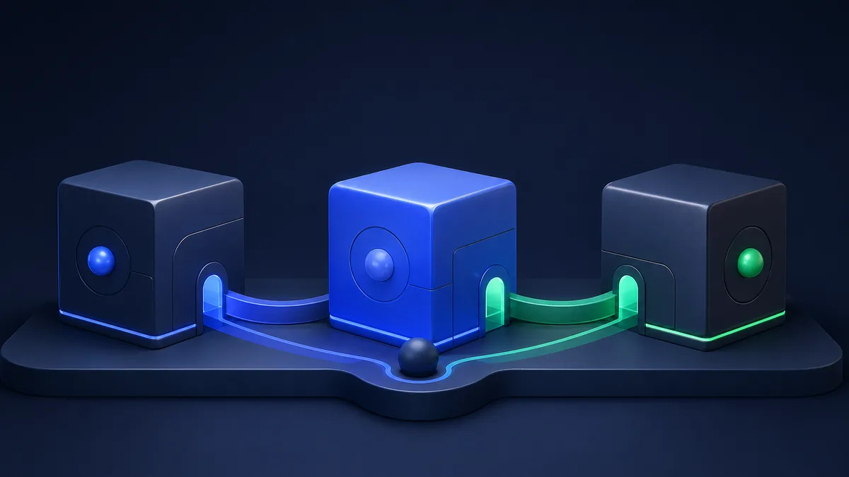
The React UI library landscape has shifted. MUI and Ant Design still lead, but Mantine's rapid rise and Chakra's evolving position have reshuffled the competitive map. We compared all four using real-time data from PkgPulse across the dimensions that matter most.
Here's what the data says.
At a Glance: The Numbers
| Metric | MUI | Ant Design | Mantine | Chakra UI |
|---|---|---|---|---|
| Weekly Downloads | 1.4M | 1.1M | 1.35M | 587K |
| GitHub Stars | 94K+ | 94K+ | 30K+ | 38K+ |
| Components | 100+ | 70+ | 100+ | 60+ |
| Bundle Size (min+gzip) | ~90KB | ~350KB+ | ~180KB | ~85KB |
| TypeScript | Built-in | Built-in | Built-in | Built-in |
| Styling Approach | Emotion (CSS-in-JS) | CSS-in-JS / CSS | CSS Modules + PostCSS | Emotion (CSS-in-JS) |
| Design System | Material Design | Ant Design | Custom | Custom |
| Current Version | 6.x | 5.x | 8.x | 3.x |
| License | MIT | MIT | MIT | MIT |
See the full live comparison — health scores and download trends — at pkgpulse.com/compare/@mui/material-vs-antd-vs-@chakra-ui/react-vs-@mantine/core
The headline stat: Mantine has nearly caught MUI in weekly downloads while having 3x fewer GitHub stars. That download-to-star ratio suggests Mantine is being adopted in production projects, not just starred and forgotten.
MUI (Material-UI): The Industry Standard
MUI is the most widely-used React component library, period. It implements Google's Material Design system with deep customization options.
Strengths
Component depth is unmatched. MUI offers 100+ components including advanced data grids, date/time pickers, tree views, and data tables that go well beyond basic UI elements. The premium tier (MUI X) adds enterprise-grade components for data-heavy applications.
Customization is thorough. The theme system lets you override every design token — colors, typography, spacing, breakpoints, shadows. The sx prop provides inline styling with theme awareness:
<Button
  sx={{
    bgcolor: 'primary.main',
    '&:hover': { bgcolor: 'primary.dark' },
    borderRadius: 2,
    px: 3,
  }}
>
  Custom Button
</Button>
Documentation is the gold standard. Every component has examples, API references, TypeScript definitions, and accessibility notes. The migration guides between major versions are detailed and actionable.
Weaknesses
Bundle size scales with usage. While tree-shaking works, MUI's CSS-in-JS runtime (Emotion) adds overhead. A typical MUI app ships 90-150KB of component library code.
Server Components friction. MUI's Emotion-based styling requires client-side rendering. In Next.js App Router projects, you'll need "use client" directives on most MUI components. MUI is working on Pigment CSS to address this, but it's not the default yet.
Material Design assumptions. If your design system isn't Material-inspired, you'll spend significant time overriding defaults. The library works with you — but it has opinions.
Ant Design: Enterprise-Grade
Ant Design is Alibaba's design system, purpose-built for enterprise applications with complex data requirements.
Strengths
Enterprise features are first-class. Table with sorting, filtering, pagination, and virtual scrolling. Form with complex validation, dynamic fields, and nested forms. Tree, Transfer, and Cascader components for hierarchical data. No other library matches this depth for admin panels and dashboards.
Internationalization is built in. 60+ locale support with right-to-left (RTL) rendering. For global enterprise apps, this saves significant development time.
Design consistency across products. The Ant Design system provides complete specifications — not just React components but design tokens, Figma files, and usage guidelines. Design-to-development handoff is smoother.
Weaknesses
Customization is the hardest of the four. Overriding Ant Design's styling requires fighting the framework. Changing basic things like button colors involves understanding their token system deeply. The ConfigProvider theme API has improved, but it's still more rigid than MUI or Mantine.
Bundle size is the largest. A full Ant Design import can exceed 350KB gzipped. Tree-shaking helps, but many components pull in shared dependencies. For consumer-facing apps where load time matters, this is a real cost.
Chinese-first ecosystem. Documentation and issue discussions often start in Chinese. English docs are good but sometimes lag behind. Some community plugins and examples are Chinese-only.
Mantine: The New Contender
Mantine has been the fastest-growing React UI library for two years running. It ships 100+ components plus hooks, form management, and notifications in a single ecosystem.
Strengths
Feature completeness rivals MUI. Mantine ships what other libraries sell as premium: rich text editor, date pickers with range support, spotlight search, notifications system, modals manager, and form validation — all included.
CSS Modules architecture. Unlike MUI and Chakra (Emotion), Mantine uses CSS Modules and PostCSS. This means:
- Better server component compatibility
- No runtime CSS-in-JS overhead
- Smaller client-side JavaScript
- Works natively with Next.js App Router
import { Button, Group, TextInput } from '@mantine/core'

function SearchForm() {
  return (
    <Group>
      <TextInput placeholder="Search packages..." flex={1} />
      <Button variant="filled">Search</Button>
    </Group>
  )
}
Hooks library is exceptional. @mantine/hooks includes 50+ hooks for common patterns — useDebounce, useIntersection, useClipboard, useHotkeys, useMediaQuery — usable independently of the UI components.
Weaknesses
Smaller ecosystem. Fewer third-party integrations, templates, and community plugins compared to MUI or Ant Design. The community is growing fast but still behind the established players.
Less enterprise adoption. MUI and Ant Design power Fortune 500 dashboards. Mantine's production references are growing but thinner. For risk-averse enterprise decisions, this matters.
Opinionated defaults. Mantine's design system is clean and modern, but if you need a radically different aesthetic, customization requires more effort than MUI's deeply configurable theme system.
Chakra UI: At a Crossroads
Chakra UI pioneered the "style props" approach — styling components with React props instead of CSS:
<Box bg="blue.500" p={4} borderRadius="md" color="white">
  Styled with props
</Box>
Strengths
Developer experience is excellent. The style prop system is intuitive — if you know CSS, you know how to style Chakra components. Accessibility is built into every component by default. The API is clean and consistent.
Bundle size is competitive. At roughly 85KB for a typical usage, Chakra is the lightest of the four for standard component sets.
Accessibility is a first-class concern. Every component follows WAI-ARIA patterns. Focus management, keyboard navigation, and screen reader support work out of the box. For teams building accessible applications, Chakra reduces that burden significantly.
Weaknesses
Growth has stalled. At 587K weekly downloads, Chakra is the only library in this comparison not trending upward. Mantine has overtaken it in both downloads and developer mindshare.
Server Component compatibility. Like MUI, Chakra's Emotion-based CSS-in-JS requires client-side rendering. The "use client" directive is needed for most components in Next.js App Router.
Fewer components. 60+ components is solid, but noticeably less than MUI (100+) or Mantine (100+). Data tables, rich text editors, and advanced date pickers require third-party packages.
The Server Components Question
This is the elephant in the room for 2026. React Server Components (RSC) change how component libraries need to work.
| Library | RSC Compatibility |
|---|---|
| Mantine | ✅ Best — CSS Modules, no runtime JS for styles |
| MUI | ⚠️ Working on it — Pigment CSS in development |
| Ant Design | ⚠️ Partial — moving toward CSS-in-JS alternatives |
| Chakra | ⚠️ Requires "use client" — Emotion dependency |
If you're building with Next.js App Router and want to minimize client-side JavaScript, Mantine's CSS Modules approach is the most aligned with the RSC model today.
When to Choose Each Library
MUI — Choose when:
- You need the deepest component library — advanced data grids, complex pickers
- Material Design fits your brand — or you'll invest in heavy theming
- Documentation quality is important — MUI's docs are the best in class
- Enterprise scale — proven at Fortune 500 companies
Ant Design — Choose when:
- You're building admin panels or dashboards — enterprise data components are unmatched
- Internationalization is required — 60+ locales, RTL support
- You need a complete design system — from Figma to code
- Your team is familiar with Ant's patterns — particularly in APAC markets
Mantine — Choose when:
- You want the most features included — forms, hooks, notifications, rich text
- Server Components matter — CSS Modules architecture is RSC-ready
- You want modern architecture — no runtime CSS-in-JS overhead
- You're starting a new project — least configuration friction
Chakra UI — Choose when:
- Accessibility is your top priority — WAI-ARIA compliance in every component
- You love the style prop DX — intuitive, CSS-like React props
- Your component needs are standard — forms, modals, navigation, layout
- Bundle size matters — lightest of the four for typical usage
The Verdict
MUI remains the safe, enterprise-proven choice with the deepest component library and best documentation.
Ant Design owns the enterprise dashboard niche — if you're building data-heavy admin tools, nothing else comes close.
Mantine is the momentum pick. The fastest growth, the most modern architecture (CSS Modules), the best RSC compatibility, and a feature set that rivals libraries twice its age. For new projects in 2026, Mantine is the hardest to argue against.
Chakra UI is a solid library that's losing ground. The style prop DX remains excellent, but the server component story and growth trajectory are concerns.
Compare all four on PkgPulse →
Frequently Asked Questions
What is the best React UI library in 2026?
There's no single best — it depends on your project. MUI for maximum component depth and documentation. Ant Design for enterprise dashboards. Mantine for modern architecture and feature completeness. Chakra UI for accessibility-first development. Check the full comparison on PkgPulse for real-time download data.
Is Mantine better than MUI?
Mantine has modern CSS Modules architecture, better server component compatibility, and includes features (forms, hooks, rich text) that MUI charges for or requires additional packages. MUI has deeper component customization, more enterprise adoption, and superior documentation. Mantine is the better choice for new projects; MUI is the safer choice for enterprise requirements.
Which React UI library works best with Next.js App Router?
Mantine's CSS Modules approach works best with React Server Components — no "use client" directives needed for styling. MUI and Chakra use Emotion (CSS-in-JS), requiring client-side rendering. Ant Design is transitioning away from CSS-in-JS but isn't fully server-compatible yet.
Explore more comparisons: MUI vs Mantine, Chakra UI vs Mantine, or DaisyUI vs shadcn/ui on PkgPulse.
Related: Angular vs React (2026), Best React Component 2026: shadcn, Mantine, Chakra, HTMX vs React 2026: 14KB vs 47KB — When Each Wins.